I should have brought my camera to the polls with me this morning in the west village, where the line of voters stretched all the way around the block. I have never heard so many New Yorkers complain so little. A mother entertained her two stroller-bound children by repeating “we are making history!” in a sing-song voice. That at least got some ironic eye-rolls from other voters after thirty minutes or so.
Chief International Correspondent for CNN, Christiane Amanpour, also in the City to vote today, sums up my thoughts so nicely in this piece. “Whatever happens, this US Election will change the world.”

And more political street art at The Scenic Sidewalk

Courtesy of Robert Elmes, Galapagos Art Space
To continue with a theme (even though Olympic fervor has mostly dissipated), the new designs for the 2012 stadium deserve a quick critical take. If I thought that China’s groundbreaking Olympic architecture was going to up the ante for this building type, in the same way that Saarinen’s TWA Terminal did for airport design, I was certainly mistaken. New designs from HOK Sport and Peter Cook for the London games are as hum-ho as almost every Olympic stadium that has proceeded it.

The colorful pods clinging to the armature of the building are reminiscent of 1980’s era amusement parks. If someone told me this was the latest ride at Great Adventure I would be unsurprised. The whole form appears to house a giant teacup dolly or whirling centrifuge.
The materials palette warrants a mention, as the “walls” of the stadium are a polymer-based fabric “wrap,” reducing the building’s embodied energy profile significantly. Recycled ship containers are put to use as internal toilet “pods.” In the world of green construction however, temporary, tensile fabric structures and the re-purposing of shipping containers don’t represent a lot of new thinking material-wise. There is a sustainability argument to be made that the building should be “light,” using as little material as possible. There is also a psychological need for an Olympic stadium to feel monumental, or at the very least consequential. This appears to be a blast from the past rather than a vision of the future.
Images and info via: BD
To see the first round of designs: Architectural Record
Today, 8/8/08, would fall short of auspicious if I failed to post Olympics-related material. So rather than focusing entirely on the Beijing smog, I will cloak my discussion of environmental pollution in the architecture of the much beloved “Bird’s Nest,” the new National Stadium by quirky-tects Jacques Herzog and Pierre de Meuron. Nicolai Oursoussof’s effervescent New York Times review of the building brilliantly skewered the sophisticated architectural allusions and their witty contradictions, so I don’t feel that I should paper over this territory. In his analysis were mentions of other, memorable olympic stadiums, and I think a visual guide of the buildings he covered is in order, as they may be difficult to recall from memory if you are younger than 100. Here you are, and quotes from the article:

“Until now, the number of memorable Olympic stadiums could be counted on one hand. There is Berlin’s 1936 Olympic Stadium, by Werner March, with its imposing ring of stone columns, a symbol of fascism’s absolute disregard for the individual.

In an intentional counterpoint, Günter Behnisch and Frei Otto designed transparent tentlike roof canopies for the 1972 Olympic Stadium in Munich, daring in their structural innovation.

And there is the elegant ring of slender Y-shaped columns supporting Pier Luigi Nervi’s Palazzetto dello Sport, which was a minor venue at the 1960 Games in Rome.” Nicolai Oursoussof
It appears to me that the Olympic stadiums of old have birthed a rather precocious youngster in the Bird’s Nest, another symbol of an era. Wholly unlike, say, the stadium shown here for the Atlanta games, so undistinguished that no photos are taken of its exterior facade.

Its always a little hard to rate the success of a work of architecture from afar. The flashy close-ups of the Bird’s Nest that accompanied the Times piece are luscious and a little misleading. Contextual photos of the new stadium are hard to come by, which is why I prefer this image below, that shows the swoopy stadium landlocked in a drab sea of staid office buildings. In this photo, the Bird’s Nest really demonstrates its ability, and by inference China’s ability, to briefly flirt with non-conformity, with all things blobular, dynamic and maybe even subversive.

But when the games are over, the citizens of Beijing will likely emerge from the liberating form of this nest, head straight back to their office buildings and work up a smog so thick it may obscure the stadium from view forever. That’s progress.
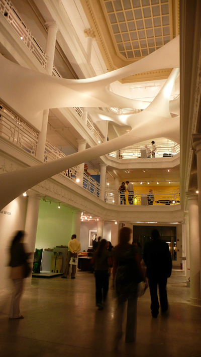
I took this photo in the atrium of the Moore Space in Miami during Art Basel last year, and now you can find it online as part of the new Schmap Miami Guide, a sort of online travel book and map with photos. You can also browse the guide on your iphone here if you are feeling fancy. The pulled taffy-looking installation criss-crossing the atrium is “Elastika” by architect Zaha Hadid.
Filed under: Architecture, Design, Green, New York City, Sustainability, Urbanism
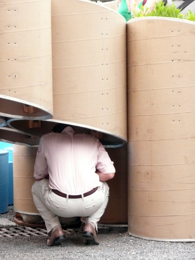
What’s cooler than agriculture? Urban agriculture that’s what. I attended a party at the temporary installation of “Public Farm One,” in the courtyard of PS.1, and had an opportunity to get up close and personal with some of the flora and a few very scared looking chickens and chicks that roam the grounds looking for brightly pedicured feet to peck.

Oversized cardboard tubes form a big, lazy V-shape, with a cutout in the middle for a wading pool, painted a florescent turquoise reminiscent of a suburban, above-ground special. When not filled to capacity with throngs of sweaty revelers, the place fails to pack much of a inspirational punch. It was a bit difficult to enjoy the plantings as they mostly hovered above observation level, likely placed there for their own protection. Walking around the enclosed courtyard, you sometimes felt as if you were in a sci-fi movie spoof – Attack of the Killer Toilet Rolls, as people ducked into and and underneath the paper columns, appearing to lose heads and hands.
According to the project’s designers, Work Architecture, the vision for the project originated from the rallying cries of French students in 1968 “Sous les pavés, la plage” (more or less, “Under the paving stones, a better life”). This concept was twisted into “Sur les paves, la ferme” (“Over the pavement, the farm.”) Everything sounds sexier in French, doesn’t it? But is the Farm really a stage for a new kind of revolution, or just a summer place to dance and drink?

Filed under: Architecture, Design, Green, New York City, Sustainability, Urbanism

A victory for me, yes, but really a victory for sustainable architecture in New York City – I just found out that I have received an honorable mention in the USGBC – NY Chapter Photo Contest (winning image above) for my picture of the new Queens Botanical Garden Visitor & Adminstration Center, designed by BKSK Architects. The building opened in September 2007 (when this photo was taken) and just received a LEED Platinum rating, a first for a public building in New York City. Another photo taken that same evening:


Leaving a party the other night on far west 46th Street – still industrial territory in New York City – I was surprised to see this banner proudly lit outside of a warehouse. In this day and age, was it true that the symbol of a corporation could be our planet earth smothered in red paint, or was this an abandoned and forgotten emblem, a holdover from a more innocent time?
As I found out, this paint covered earth logo was conceived in a vastly more innocent time, the late 1800’s to be exact, and is actively used as a corporate logo today. The Sherwin Williams website explains the history. that “the logo’s purpose was to represent the company’s desire to help beautify and protect the buildings of the world.” Hmm. The explanation goes on to say that “Over the years our “Cover the Earth” logo has become a figurative emblem signifying integrity and service.”
I don’t often dispense free marketing advice, but I would say that changing a corporate logo once or twice in 100+ years is not necessarily a bad thing, though I can’t think of a proper corporate logo that represents fuzzy concepts like “integrity and service.” I can think of a corporate logo that represents industrial pollution though, and it looks something like a paint smothered earth.
Sherwin Williams is by no means an industry leader in the sustainability game either. They offer a lone line of VOC (volatile organic compound) free paint, and self-certify their products using their own “GreenSure” designation, instead of using an independent third-party certification program. 100 years on the logo still kinda suits.

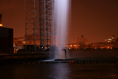
Much ado has been made over Eliasson’s Waterfalls, and after seeing them at night I can confirm that at least some of the hype is justified. A leisurely stroll to the Eastern-most end of Grand Street at dusk, and you are treated to these lovely views of falling water along the promenade, mystically lit. One waterfall south of the pier is close up and clearly visible, and another peeks into view under the bridge in the distance. It just might be the biggest temporary piece of public art in New York City since Christo’s Gates.

Mini-trend warning – New York City is having a love affair with all things Nordic. I am basing this on three things that I like, two things somewhat design-y in nature:
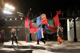
1. I just saw the Shakespeare in the Park production of Hamlet, featuring a curious, streamlined set design reminiscent of a postwar cruise ship, or repurposed military vessel. This is a tale based in Denmark after all. It would have been nice to throw a classic Jacobsen or Panton piece of furniture in there, it would have been right at home. Even the weird puppet in this picture – part of the play within the play – made sense in a quirky Scandinavian sort of way.
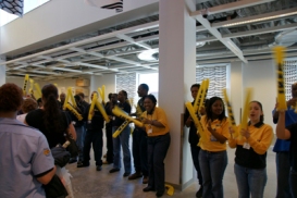
2. Speaking of quirky Scandinavians and streamlined design, New Yorkers flocked to the new Ikea in Red Hook, Brooklyn this weekend. I didn’t feel like camping out in front of the store for a week, but someone else was lucky enough to be greeted by cheerful Ikea employees at the door and took this picture. I think they are beating ballons together, like at a baseball game? And singing? A tribute to good and inexpensive design perhaps?
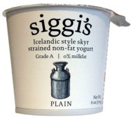
3. My friend Siggi’s Icelandic yogurt is called Siggi’s Skyr. Plus all the architect’s in my firm are mad for it, so maybe this item is design-related too.

Great photos of the new Digital Water Pavillion, courtesy of the deep thinkers over at MIT’s Design Laboratory. It works like a giant inkjet printer, and each “showerhead” is computer controlled, allowing the wall of water to morph into shapes or even letters. Equipped with sensors, the wall can also detect people approaching and part the water to allow entry into the building. Biblical.
Image via: Digital Water Pavillion

